 From the menu choose
to produce frequency tables for one or more variables.
The dialog contains the usual variable list
[
From the menu choose
to produce frequency tables for one or more variables.
The dialog contains the usual variable list
[ Variable dialog]
as well as several buttons:
Variable dialog]
as well as several buttons:
| Frequency | SPSS |
| Resources ? | Back |
A frequency table displays counts and percentages for each distinct value found in a variable (normally a categorical variable). Frequency tables are produced using the Frequency or from the context menu of the data editor
From the menu choose
to produce frequency tables for one or more variables.
The dialog contains the usual variable list
[Variable dialog]
as well as several buttons:
The default frequency table looks like one of the two presented below.

This is the table you get if the default options for tables are set to display only
variable labels
and
value labels. This table is good for publication and
presentation.
 This is the table you get if the default option for tables are set to display only
variable names and
variable labels
as well as
values and
value labels.
In practice, this kind of table is much better while working and analyzing data,
as you use variable names to refer to variables,
and values for instance in recoding operations.
This is the table you get if the default option for tables are set to display only
variable names and
variable labels
as well as
values and
value labels.
In practice, this kind of table is much better while working and analyzing data,
as you use variable names to refer to variables,
and values for instance in recoding operations.
These settings can be modified with
 Setting options (Output labels tab) .
Let us now have a brief look at the "anatomy" of a frequency table.
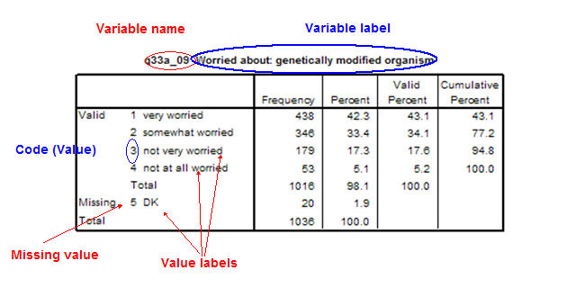
The body of the frequency table contains the following summary data for each distinct value found in the variable
Some important terms:
The button lets you request many descriptive statistics, however you should be aware that many of these statistics require interval scaled variables, i.e. are not applicable to e.g. nominal variables.
With the button you can control how the frequency table is displayed (sorting frequencies, suppressing the production of all [to produce only statistics or charts] or big tables [too many frequencies]) or how frequency table requests for many variables are handled.
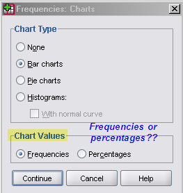 The button lets you request barcharts, pie charts and
histograms (all charts are also available from the
menu). Again make sure to understand that not all charts are suitable for all kinds of
variables, namely histograms are meant for interval scaled variable (as well as the
addition of the normal curve); pie and bar charts look quite strange with (too)
many categories.
The button lets you request barcharts, pie charts and
histograms (all charts are also available from the
menu). Again make sure to understand that not all charts are suitable for all kinds of
variables, namely histograms are meant for interval scaled variable (as well as the
addition of the normal curve); pie and bar charts look quite strange with (too)
many categories.