 Here's a typical three-way table produced with showing whether people use Public Transport according to sex and linguistic region (percentages and counts).
In addition to the editing features SPSS lets you rearrange the structure of the table.
 Here's a typical three-way table produced with showing whether people use Public Transport according to sex and linguistic region (percentages and counts).
 Maybe you have noticed that double-clicking a table adds a
item to the menu bar.
Select
(or alternatively
from the context menu).
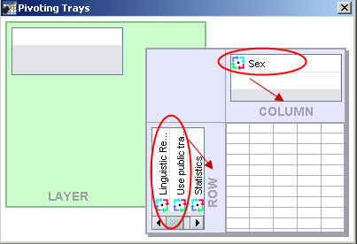
A window, as shown here, will appear. It shows
a structural presentation of the table: Sex as a variable, "Use public transport"
and "Linguistic region" as variables and within the data cells two containing
counts and percentages ("Statistics").
Note also the  icon appearing in front of all these
elements.
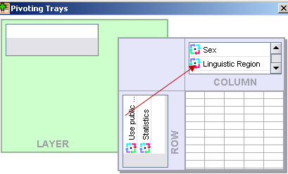
 These icons can be used to place any element into any dimension of the table (rows, columns
or layers). As soon as an element is moved, the table is automatically rearranged to reflect
the new structure of the table.

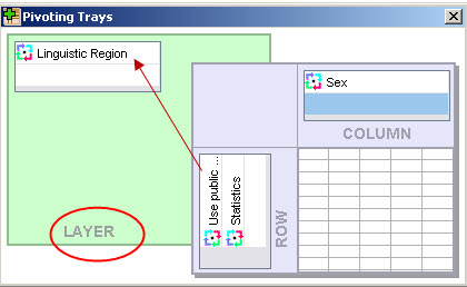
 As shown, you can also move an icon into the dimension,
here "Linguistic region" icon to the "layer" element as
shown to the right to produce the following table:

 Note that the table only shows German speakers,
but you can easily select one of the other linguistic regions from the drop down list that opens
when you click on
 If you move the icon into the layer dimension you will be
able to choose the statistics you would like to see screen.
These features are very powerful and offer a number of advantages:
Note that these interactive features are not mere editing features, but also powerful analysis tools, as you can quickly move through may different views of the table, e.g. quickly switching from German to French speakers, interpret percentages and have a quick look at the counts. Learning to use these features are rewarding, especially when you have to read highly complex tables.
It is also possible to reorder categories.
You can reorder categories the following way:

