When examining a variable you will consider several aspects at the same time...
Besides aspects of suitability of the variable as an indicator for your concept and missing values and other measurement problems, the following statistical aspects need to be considered:
It is important to understand that all statistical tools rely on a number of , if the assumptions do not hold, the tool will mislead you. For instance, the mean requires the distribution to be symmetrical. By the way as the mean is central in classical statistics, the requirement of applies to many tools (correlation, regression, ....).
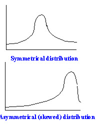
Ideally speaking the shape of the distribution should be symmetrical as shown in the histogram to the left (top)
Asymmetrical distributions need to be diagnosed and you should be aware that the mean for instance cannot be used to describe its central tendancy.
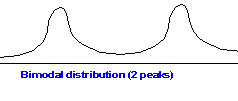 Obviously whenever more than one peak is present,
a simple summary will not be enough. In this case a single mean is completely misleading, as it does
not inform you about the essential feature of the distribution, i.e. it has two peaks,
Obviously whenever more than one peak is present,
a simple summary will not be enough. In this case a single mean is completely misleading, as it does
not inform you about the essential feature of the distribution, i.e. it has two peaks,
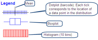
When diagnosing variables it is important to use several tools. Numerical summaries like the mean and the standard deviation are clearly insufficient; graphical tools are ideally suited for this purpose, but you should be aware of the fact that all tools have their strengths and weaknesses and, as a general advice, it is best to use several of them. In the examples below we will use histograms, boxplots and dotplots.
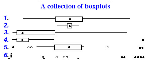
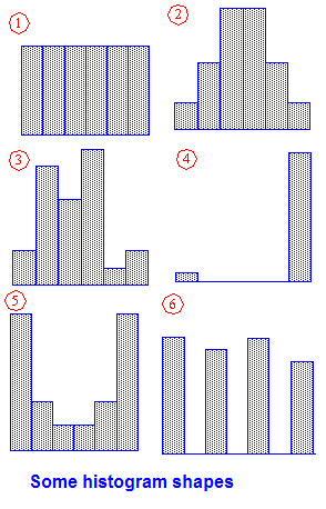 Here's a collection of different
histogram shapes.
Here's a collection of different
histogram shapes.
 Histograms are useful graphical summaries,
but they have there shortcomings. In the collection the histograms have only a couple of bins (to
the left only three). Note that the choice of the numbers of bins (bars) can, with some variables,
lead to wrong conclusions about the shape and other aspects of the distribution.
Histograms are useful graphical summaries,
but they have there shortcomings. In the collection the histograms have only a couple of bins (to
the left only three). Note that the choice of the numbers of bins (bars) can, with some variables,
lead to wrong conclusions about the shape and other aspects of the distribution.
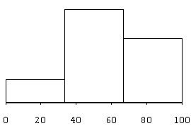
 The histogram with three bins considered also
"hides" the fact, that the observations are not evenly distributed across the range of the observations
and within the bins. (The ticks mark the positions of data values in a variable), and fails to
let us see the .
The histogram with three bins considered also
"hides" the fact, that the observations are not evenly distributed across the range of the observations
and within the bins. (The ticks mark the positions of data values in a variable), and fails to
let us see the .
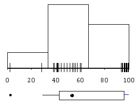
The boxplot at the bottom of the graph clearly identifies that outlier and gives us a alternative picture of our distribution. Note however that both the histogram and the boxplot do not show clearly that the main crowd is in the middle, to the left of it, two single points, and, far away to the right a smaller dense group.
Boxplots are powerful tools to show central tendancy (median=dot in the box); variation (interquartile range = width of the box), shape of the distribution (position of the box, relative position of the median) and identifies the presence of outliers. Some examples with comments:
 |
Let us now examine a collection of examples using three graphical tools: boxplots, histograms and dotplots, and considering also two summary statistics the mean and the standard deviation (commented in the text). The collection clearly shows that you always need several tools to tell the full story of each distribution, a single tool alone cannot catch all aspects, numerical summaries like the mean or the standard deviation are not always useful as they rely on highly specific assumptions, namely symmetry. |
 |
A uniform distribution; the mean is appropriate to summarize the center, as is the standard deviation to characterize spread, but you really need the histogram to see the perfectly uniform distribution, the boxplot only tells you that this is a symmetrical distribution with no outliers. |
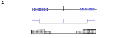 |
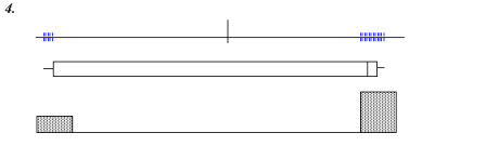
Only the dotplot and the histogram let you detect the main feature of this variable, i.e. there are clearly two groups of observations at both ends of the distribution, the middle part left empty. The average is completely off mark, as is the standard deviation |
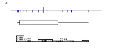 |
In this case the dotplot clearly shows you the scattered, discontinuous nature of this distribution, with small groups and isolated observations. The boxplot shows you the asymmetry of the distribution (but not the discontinuous aspect); the histograms with ten bins does not let you see the discontinuities either. |
 |
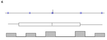
Here you clearly need both the dotplot (or the histogram) and the boxplot. The dotplot lets you see a big group and a small group; the boxplot however tells you that the small is not so small that they have to be considered as outliers. |
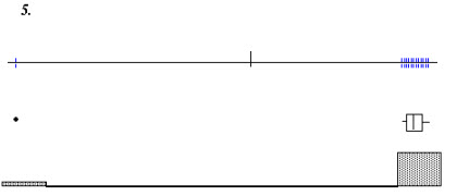 |
Obviously the boxplot is the best tool here, as it clearly shows the outlier and identifies it as such; the dotplot clearly shows the one observation far away form the others (in a somewhat less extreme only the boxplot would let you distinguish between an outlier and a single observation somewhat apart from the others. |
 |
Five clearly distinct groups (is this really a continuous variable); only the dotplot lets you discover this, the histogram to some extent, but you might be mislead by the width of the bin. |