Introduction
Most barcharts are graphical representations of frequency tables and crosstabulations, i.e. they let you visually examine
the distribution of counts and percentages. Instead of showing s relative (percentage) or absolute (count)
of a categorical variable, a bar can also represent a statistic of another variable, e.g. averages of continuous variables or
percentages below or above some threshold.
There are several ways to produce barcharts in SPSS:
- Use (details below) or if you want
three dimensional barcharts
- Some statistical procedures have options to produce straighforward barcharts:
- Frequencies (Chart button on the dialog panel)
produces a simple barchart (option to depict counts or percentages9.
- Crosstabs (check box on the main dialog) produce
a simple bivariate barchart showing counts only (no options)
like frequencies (Chart button on the dialog panel) and
Crosstabs (check box on the main dialog) have options to produce straightforward barcharts
- Barcharts produced with the (details below)
- Barcharts from pivot tables. [See below for details]
 will ask you first what kind of barchart you
would like to produce. According to your selection a number of different types will be produced:
barcharts depicting a single variable, barcharts showing two variables, either side by side (clustered, dodged) or
one on top of the other (stacked); you can also compare several variables. With all combinations of options, a wide variety of barcharts can be produced.
Please understand that not all forms of barcharts are meaningful for all situations; the default SPSS proposes
corresponds to the most common use but may not be what you want.
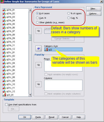 This dialog comes
up with the default selection.
Changing what bars represent
By default a barchart shows the number of observations in each bar; select
% of cases to show percentages;
Instead of absolute or relative frequencies of the variable depicted, a statistic
for another variable can be shown instead.
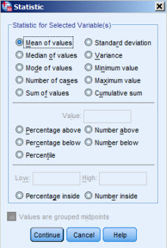 If you select
Other Statistic you will have to select an additional
variable; by default the mean is used, e.g. you might show the average age for
every category of the "Satisfaction of life" variable. You can select another statistic using
Change Statistic (see on the left).
You should however be very careful to select the appropriate statistic to show, as for instance
the mean of a categorical variable does not make sense. Although the mean makes sense for a
continuous variable, e.g. age in years, charts with bars showing just the mean for each category are rather
poor in content, a much better alternative would be a boxplot.
More than one variable
Clustered and stacked barcharts.
 If you select Clustered or Stacked on the inital
dialog, a second categorical variable can be defined as illustrated by the example (clustered barchart).
Panels: Studying relationships using barcharts
 Standard barcharts are used to depict a single (categorical variable) and other
forms (stacked, clustered) allow
for the comparison of several variables. In addition to these possibilities, barcharts can be arranged in "panels", i.e.
barcharts produced for all categories of one or more other categorical variables. Here's an example depicting
"Satisfaction with Life",
across categories of "sex" and "religion", i.e. in the top left corner you see a barchart of satisfaction with life for
male catholics.
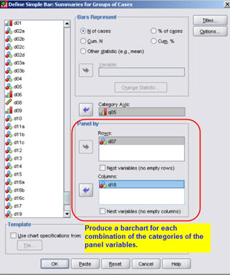 Here's the dialog that lets you produce this panel plot.
Note by the way that panel plots can be obtained for all graphic types.
Barcharts with the Chart Builder

The produces a wide variety of
barcharts.
Select the kind of barchart you wish to produce, drag it to the preview area, as explained
in the document on using the
Barcharts from the pivot editor
Barcharts can also be produced from numbers in tables in the
.
The example illustrates a barchart produced from the selected percentages in a frequency table.
After selecting the data you wish to depict, choose from the
context menu. Make sure to select only the percentages of interest, i.e. in the example, do not select the 100%, as
you do not want a misleading total bar to dominate the chart. (If you select it you can of course
remove it, using the , but then you
would also have to adjust the scales of the chart).
This works from any pivot table. Be very careful when selecting the numbers/cells to
be shown in the chart, and verify the resulting graph, as it might need some ajustments
(elements shown, scales and especially legends, titles etc.)
Editing bar charts
Like all charts, a barchart can be edited using the
.
 will ask you first what kind of barchart you
would like to produce. According to your selection a number of different types will be produced:
barcharts depicting a single variable, barcharts showing two variables, either side by side (clustered, dodged) or
one on top of the other (stacked); you can also compare several variables. With all combinations of options, a wide variety of barcharts can be produced.
Please understand that not all forms of barcharts are meaningful for all situations; the default SPSS proposes
corresponds to the most common use but may not be what you want.
 This dialog comes
up with the default selection.
 If you select
 If you select
  Standard barcharts are used to depict a single (categorical variable) and other
forms (stacked, clustered) allow
for the comparison of several variables. In addition to these possibilities, barcharts can be arranged in "panels", i.e.
barcharts produced for all categories of one or more other categorical variables. Here's an example depicting
"Satisfaction with Life",
across categories of "sex" and "religion", i.e. in the top left corner you see a barchart of satisfaction with life for
male catholics.
 Here's the dialog that lets you produce this panel plot.
Note by the way that panel plots can be obtained for all graphic types.